题目
范文
2025/02/22Task 1曲线图
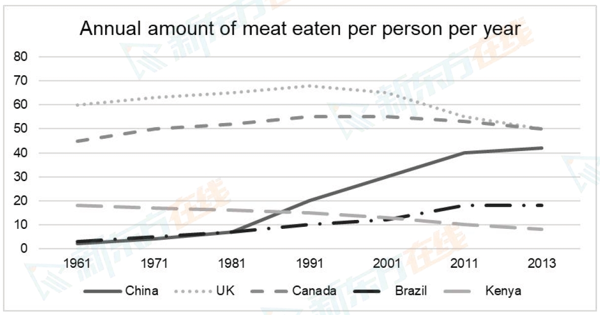
The graph below shows the annual amount (kg) of meat eaten per person in five different countries from 1961 to 2013.
Summarise the information by selecting and reporting the main features, and make comparisons where relevant.
Write at least 150 words.
Summarise the information by selecting and reporting the main features, and make comparisons where relevant.
Write at least 150 words.
高分范文
上一题
2025/03/08 Task 2下一题
2025/02/22 Task 2