题目
范文
2024/12/21Task 1柱状图
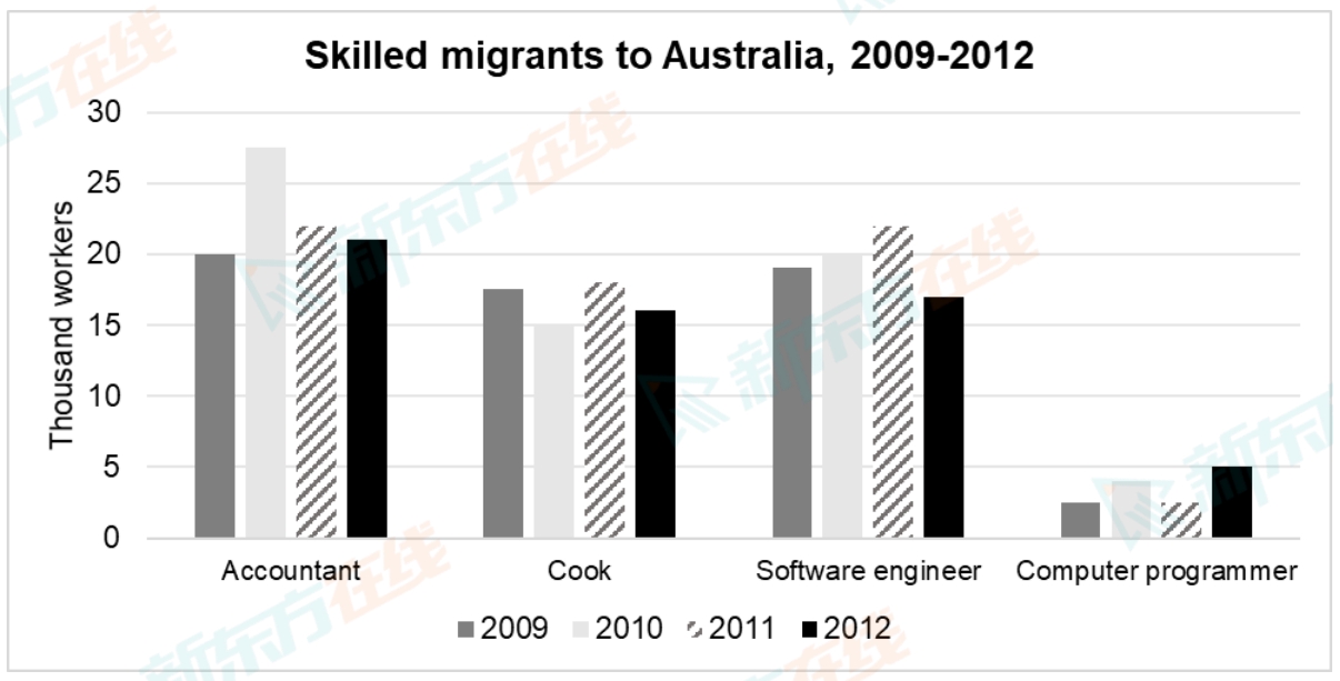
The bar chart below gives information on the numbers of workers in different occupations who migrated to Australia between 2009 and 2012.
Summarise the information by selecting and reporting the main features, and make comparisons where relevant.
Write at least 150 words.
Summarise the information by selecting and reporting the main features, and make comparisons where relevant.
Write at least 150 words.
高分范文
上一题
2024/12/28 Task 2下一题
2024/12/21 Task 2