题目
范文
2021/07/24Task 1饼状图
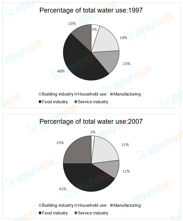
The charts below show the percentage of water used by different sectors in Sydney, Australia, in 1997 and 2007.
Summarise the information by selecting and reporting the main features, and make comparisons where relevant.
Write at least 150 words.
Summarise the information by selecting and reporting the main features, and make comparisons where relevant.
Write at least 150 words.
高分范文
上一题
2021/07/31 Task 2下一题
2021/07/24 Task 2