题目
范文
2019/04/13Task 1柱状图
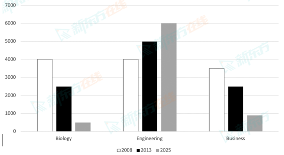
The chart below shows the changes in the number of students applying for three different kinds of courses in a university between 2008 and 2025.
Summarise the information by selecting and reporting the main features, and make comparisons where relevant.
Write at least 150 words.
Summarise the information by selecting and reporting the main features, and make comparisons where relevant.
Write at least 150 words.
高分范文
上一题
2019/04/25 Task 2下一题
2019/04/13 Task 2