题目
范文
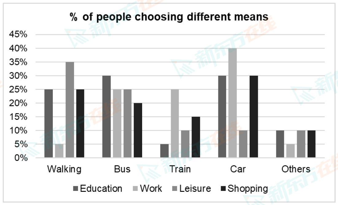
2025/11/15Task 1柱状图
The chart below shows the percentage of people choosing different ways of transport for different purposes in the UK in 2013.
Summarise the information by selecting and reporting the main features, and make comparisons where relevant.
Write at least 150 words.
Summarise the information by selecting and reporting the main features, and make comparisons where relevant.
Write at least 150 words.
高分范文