题目
范文
2025/07/19Task 1柱状图
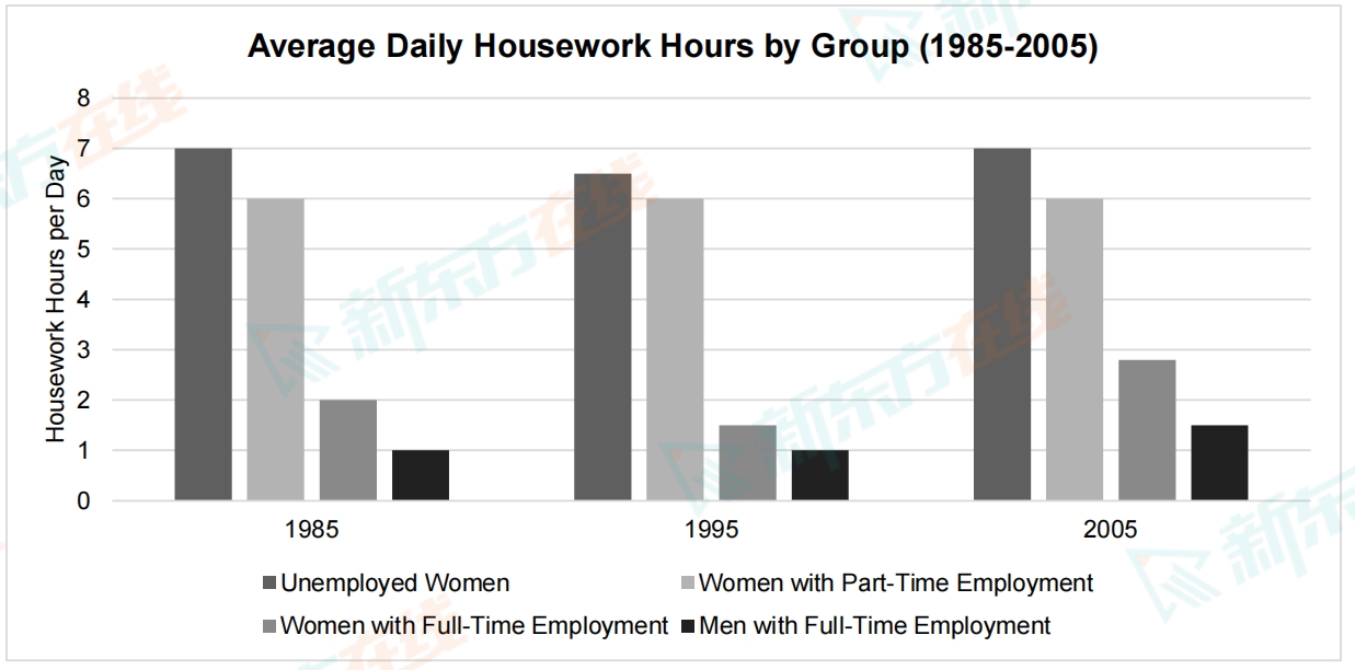
The chart below shows the average daily hours spent on housework by four different groups of people from 1985 to 2005.
Summarise the information by selecting and reporting the main features, and make comparisons where relevant.
Write at least 150 words.
Summarise the information by selecting and reporting the main features, and make comparisons where relevant.
Write at least 150 words.
高分范文
上一题
2025/07/26 Task 2下一题
2025/07/19 Task 2