2015.07.31 10:47
新东方在线雅思频道特为大家收集整理了雅思写作Task1柱状图考官范文(24)。认真研读一定的雅思范文及作文模板可以帮助我们检验自己的写作水平,并能很好地吸收和应用优秀范文里的优秀内容~更多雅思报名官网的最新消息,最新、最专业的雅思备考资料,新东方在线雅思网将第一时间为大家发布。
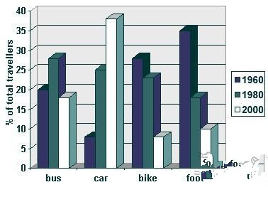
The graph below shows the different modes of transport used to travel to and from work in one European city in 1960, 1980 and 2000.
Write a report for a university lecturer describing the information below.

Sample Answer:
The provided column graph represents information on travelers’ preferences of vehicles to go and come-back from work in a European city in three different years namely 1960, 1980 and 2000.
As is observed from the figure, car was the widely used mode of transport in the year 2000 than it was in other two decades: 1960 & 1980, and the number of people used to walk on foot earlier, gradually decreased over the time.
In 1960, almost 20 percent people used buses to and from workplaces and this percentage increased to almost 28% after 20 years in 1980. In the year 2000, the bus users fell to less than 20%. On the contrary , in case of private car, the users were only about 7% in 1960, which was the lowest among the 4 transportation systems, and this amount increased sharply in 1980 amounting 25% and in 2000 more than 38% , making it the most used form of transportation system. More than 27% people used bike in 1960 and in 1980 the number decreased slightly by 5% but in 2000 dramatically fall to about 7%. Finally 35% people used to walk to go to work and to return from there. But this foot-walkers number declined significantly at only 18% in 80'S and in 2000 at 10%, probably because of the increased uses of private car.
In conclusion, more people used to walk to travel to workplaces in 1960 but with the increased popularity of private cars this amount became tiny in 2000.
(Approximately 252 words)
(This model answer can be followed as an example of a very good answer. However, please note that this is just one example out of many possible approaches.)
Alternative Answer:
The supplied bar graph gives data on different transportation systems people used in a European city in three decades: 1960,1980 and 2000 and compares how the habit of going to work and returning from there had changed over a 40 years of period.
As described in the graph, with the increased use of cars, peoples' habit of using bikes and walking on foots had decreased significantly over the time.
Initially in the year 1960, lots of people used to move either on foot or using a bike which were 35% & about 27% consecutively compared to only about 7% private cars and about 20% buses. After 20 years in 1980, the number of car and bus users grew up noticeably to 25% and to about 28%.The private car users grew more than 3 times over 20 years and in the same year people traveling on foot fell to less than half as it was in 1960 amounting only 18% of the total travellers. And finally in 2000, only 10% work-goers walked, only about 7% people rode a bicycle compared to 18% bus users and about 38% private car users. In 1960, majority of the people travelled to and from work on foot or using a car but the scenario became completely different after 40 years when most of the people used cars or buses.
(Approximately 224 words)
(This model answer can be followed as an example of a very good answer. However, please note that this is just one example out of many possible approaches.)

扫码添加助教号
免费获取最新雅思口语题库
